Overview
Dwolla offers a robust white labeled payments API that enables businesses to fully customize the user experience end-to-end. The flexibility provided with the Dwolla platform offers a high degree of customization enabling you, the integrating business, to design and build the entire payments experience. Your business is responsible for all interactions with your end users, including collecting required information via your application and sending it to Dwolla via the API. Dwolla’s UI Components are low-code tools designed to abstract away as much of the front-end work involved for interacting with your end user for Dwolla related functions. The components library has modularized many aspects of the Dwolla Platform and offers pre-built “drop-in” components that can be customized to match the look and feel of your application’s UI. In this guide, we’ll cover the basics of leveraging Dwolla’s UI Components library to drop-in a wide range of payment functionalities into your application.Learn more about Dwolla's UI Components
Before you begin
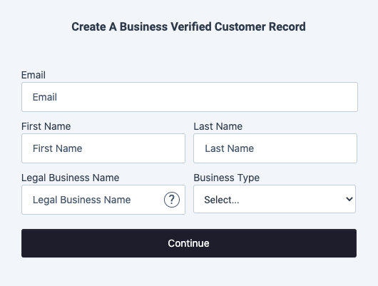
If you haven’t already, we encourage you to create a account. This will allow you to follow along with the steps outlined in this guide. Check out our Sandbox guide to learn more. In addition to using the Dwolla Components Library, you’ll need a server-side SDK in order to facilitate the API request to Dwolla to retrieve a client-token. A client-token is a unique token scoped to the end user/Customer performing the action on the front-end of your web application. In order to utilize these drop-in components, you will want to have an understanding of the different Customer account types available to be created for your end users. For more information on Customer types, check out our Concept article. In this guide, we’ll learn how to use the “Create a Business Verified Customer” component. Let’s get started!Step 1 - Setup and configuration
We’ll begin by setting up and configuring both the Dwolla Components library and installing a server-side SDK. This guide assumes that you have the basic structure of a web application set up and running, which includes a backend language (e.g. Node.js, Python, etc.) and a web front end (HTML, CSS, Javascript). To get up and running quickly, take a look at our drop-ins examples repo which is a basic Node.js app that uses Express.Include dwolla-web.js
Begin the client-side implementation by including dwolla-web.js in the ‘head’ of your HTML page. The Dwolla Components library containing all of the drop-in UI components are available directly from Dwolla’s content delivery network (CDN). As we continue to evolve the components library, it will soon be available to be installed via NPM.Install and configure server-side SDK
Dwolla has a collection of SDKs available in a variety of server-side programming languages. You’ll want to be sure to install an SDK or utilize a third party HTTP client library before completing Step 2.Install
Configure
Step 2 - Generate a client token
Regardless of which drop-in component is being used by your application, the dwolla-web.js JavaScript library will require a unique “client-token” or a server side route that is used to generate a client token to be passed in on configuration. A client token contains granular permissions and is scoped to the end user/Customer that is performing the action within your web application. Client-tokens are single-use tokens that are valid for up to 1 hour after being generated. More than one client token can be generated and be valid at one time.Token URL vs Token Configuration
A majority of the drop-in components have multiple isolated functions connected together into a single user flow. Throughout the flow of a component, the dwolla-web library will make multiple HTTP calls to an endpoint you have set up on your server side for fetching client-tokens as needed. In the following sections we’ll outline the difference between the two options available in dwolla-web.js for retrieving client-tokens; using either thetokenUrl or token configuration.
Using Token URL
Using thetokenUrl option when configuring dwolla-web.js requires creating a server-side endpoint that can be called by the library when an action needs to be performed within a flow component. Establishing an endpoint enables the ability for the component to fetch client-tokens on-demand in order to render the appropriate UI. The server-side endpoint should act as a pass-through by taking in the request body required in order to make the appropriate call to the ‘/client-tokens’ endpoint. Upon success, the ‘/client-tokens’ endpoint will return a response body including a “token” string value. The HTTP response that is returned to the client-side is expecting an object in the format of {token: 'Token string value'}. More information on configuration of dwolla-web.js can be found in step 3 of this guide.
Example of setting up a token endpoint server side using Express
In this example we’re using Express.js to set up a token URL which will be called bydwolla-web.js when the component that’s being used needs to generate a client token that’s being performed in the flow.
Example configuration using tokenUrl
Using Token
Using thetoken option when configuring the dwolla-web.js library allows you to create a function that calls your server-side tokenUrl endpoint (as described above). The function you create takes in two arguments, 1) the request body that is required to make the ‘/client-tokens’ API request; and 2) a JSON object that includes key:value pairs for specifying custom headers. When an action needs to be performed within a flow component, the dwolla-web.js library will call your custom function and dynamically pass in a request body as the first argument. The server-side endpoint should act as a pass-through by taking in the request body required in order to make the appropriate call to the ‘/client-tokens’ endpoint. Upon success, the ‘/client-tokens’ endpoint will return a response body including a “token” string value. The HTTP response that is returned to the client-side is expecting an object in the format of {token: 'Token string value'}.
Example of setting up a function to call tokenUrl using Express
Example configuration using token
Step 3 - Using a drop-in
Next, you’ll create a custom HTML container that the drop-in component will render in on page load. A drop-in component will be rendered when the dwolla-web.js library is initialized using dwolla.configure() (referenced below).Configure dwolla-web.js
Configuration of the dwolla object includes: token or tokenUrl, environment, optional styles, along with success and error overrides.Configure options object
| Parameter | Type | Description |
|---|---|---|
| environment | string | Acceptable values of: sandbox or production |
| styles | string | Optional. A relative or absolute URL linking to a hosted stylesheet containing component styles. |
| token | function | A function that gets called by the component for fetching client-tokens as needed throughout the flow. Example usage: token: (req) => Promise.resolve(dwollaAPIToken(req, {blah: "abcd"})) |
| tokenUrl | function | A URL pointing to a server-side endpoint that can be used to generate client-token. Example usage: tokenUrl: "tokenUrl" |
| success | function | A function that gets called upon a successful request from the Component. |
| error | function | A function that gets called when an error occurs in the Component. |
tokenUrl
token
Component Styles
Dwolla provides a list of CSS classes available for styling certain elements of the component. These elements can be customized to match the look and feel of your application and are styled by passing in a custom stylesheet when configuring the dwolla-web client library. By default, the elements within your specified container are responsive to any change in screen size. For a full list of supported CSS classes available for each component, view our Concept article.Using Drop-in Components
It’s important to note that with the exception of a “Create a Customer” component like the one found below, all components require a Customer ID to be passed into acustomerId element in order to initialize the component. This Customer ID should come from your back-end server when generating a client-token for an end user/Customer and can optionally be stored in a session or cookie.
Handle component success and errors
Upon submission of form components, a user facing message will be displayed to the end user on success or error. These user facing messages can be styled via custom div and span CSS classes corresponding to:dwolla-successanddwolla-success-messagedwolla-erroranddwolla-error-message
Error callback
The error callback function catches any exceptions encountered with the component and returns a string. Example:We have encountered an issue fetching a token.
Success callback
The success callback function is called when the component makes a request to the API. However, it doesn’t necessarily mean that the API request itself was successful. It means that the component was implemented correctly and no exceptions were encountered. The success function returns a JSON object that contains aresource which denotes the resource in the API related to the action being performed, and a response which contains any relevant information from the API response. If the component creates a new resource in the API, the response will contain a location key:value pair including a link to the created resource. Otherwise, it will contain the JSON response body from the API that corresponds to the action that occurred.
Here are some example responses you can expect in the success callback: